


INNO
VATE
a b c d e f g h i j k l m n o p q r s t u v w x y z
0 1 2 3 4 5 6 7 8 9 . , : ; ! ? @ # & *
Technology & Manufacturing
Brand Identity · Visual System · Guidelines
Creative Direction · Logo System · Brand Presentation
A scalable identity system built for clarity, consistency and future growth.
RTECH was born from a singular conviction: that the line between what is possible and what has been done should not exist. Founded at the intersection of IT infrastructure, smart manufacturing, and next-generation consumer devices, RTECH is not a company that follows technological curves — it bends them.
The name carries a double resonance. "R" — Raw, Revolutionary, Real. "TECH" — not mere technology, but the craft and precision of engineering elevated to art. Together they form an identity that is both immediately understood and endlessly layered.
This identity system was designed to embody that duality: a visual language that feels simultaneously cutting-edge and timeless, premium and accessible, mechanical and human.
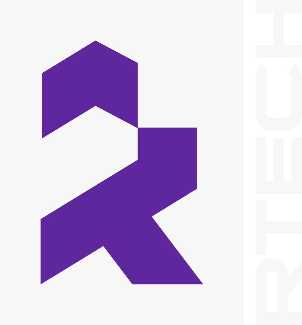
The mark begins with a deconstructed T: backbone of the brand. Representing Technology, Trust, and Transformation — the T’s rigid horizontals and verticals establish stability at the core of the identity.
Layered over the T, the R brings motion and direction. Its distinctive diagonal leg breaks the rigid geometry — introducing dynamism, forward momentum, and the sense of a company always leaning into the future.
The mark anchors in a bold square field. Squares represent stability, precision, and industrial confidence. The purple field creates an unmistakable silhouette — recognisable at favicon scale or building-facade scale.
The result is a mark that functions across every medium without losing its visual weight or structural integrity. A true platform logo built to last decades.
Purple is the territory where power and imagination meet. Silver is the future, rendered in light.
RTECH’s primary purple (#611c93) is deep, saturated, and authoritative. It signals premium quality without luxury pretension. It is the colour of ambition — of systems that run at 3am when nothing else does.
Silver (#e7ecf0) acts as the dominant light tone — present on every surface where clarity and precision matter. Slate (#888b8c) handles hierarchy and supporting text. Deep Space (#010203) grounds it all.
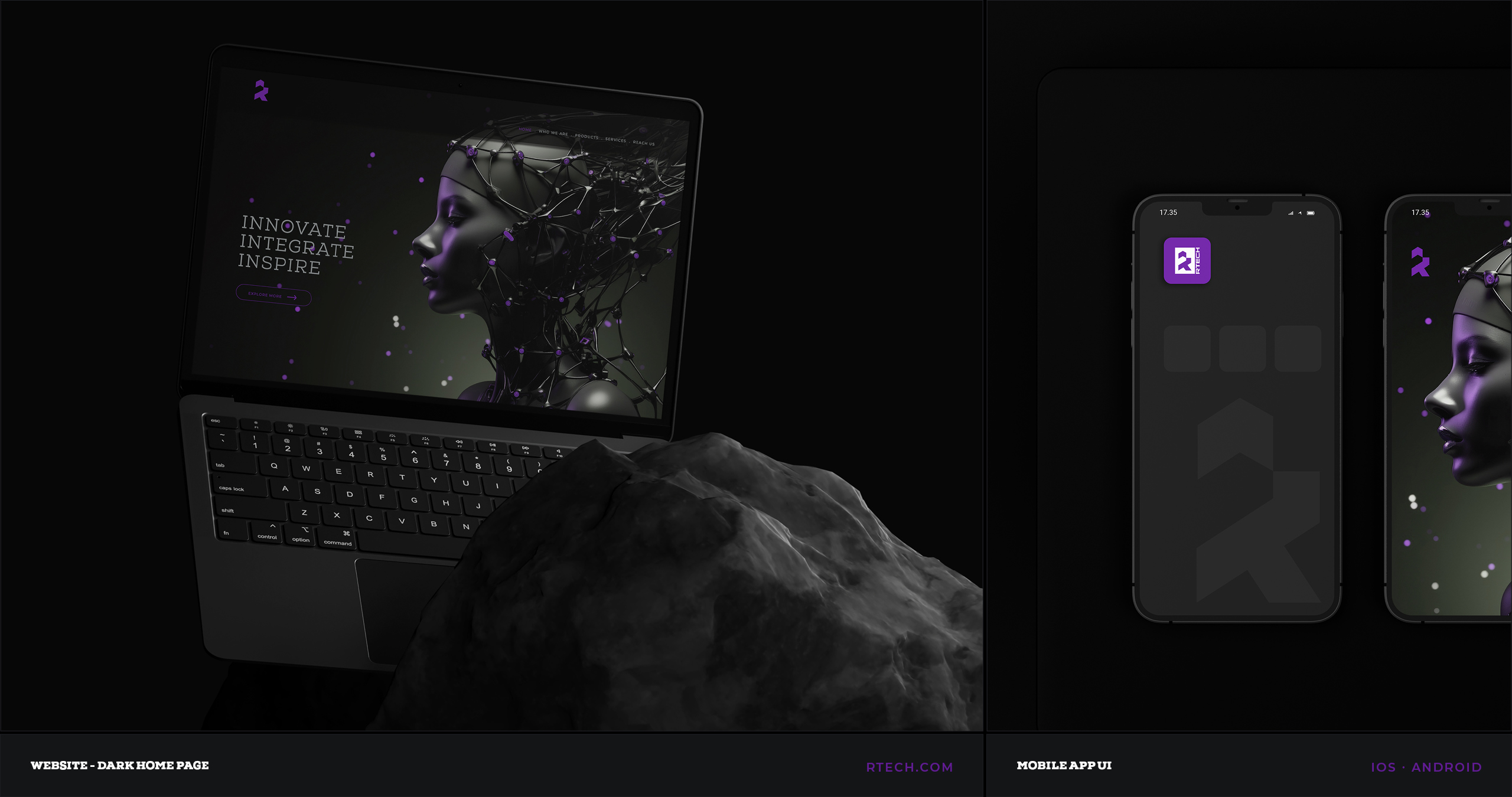
Dark-first presence with purple accents on Deep Space. Nexa Slab headlines, Space Grotesk body copy and silver text across key interactive elements.
A connected device hub for wearables, monitoring interfaces and product control, using purple as the primary action signal across the UI system.
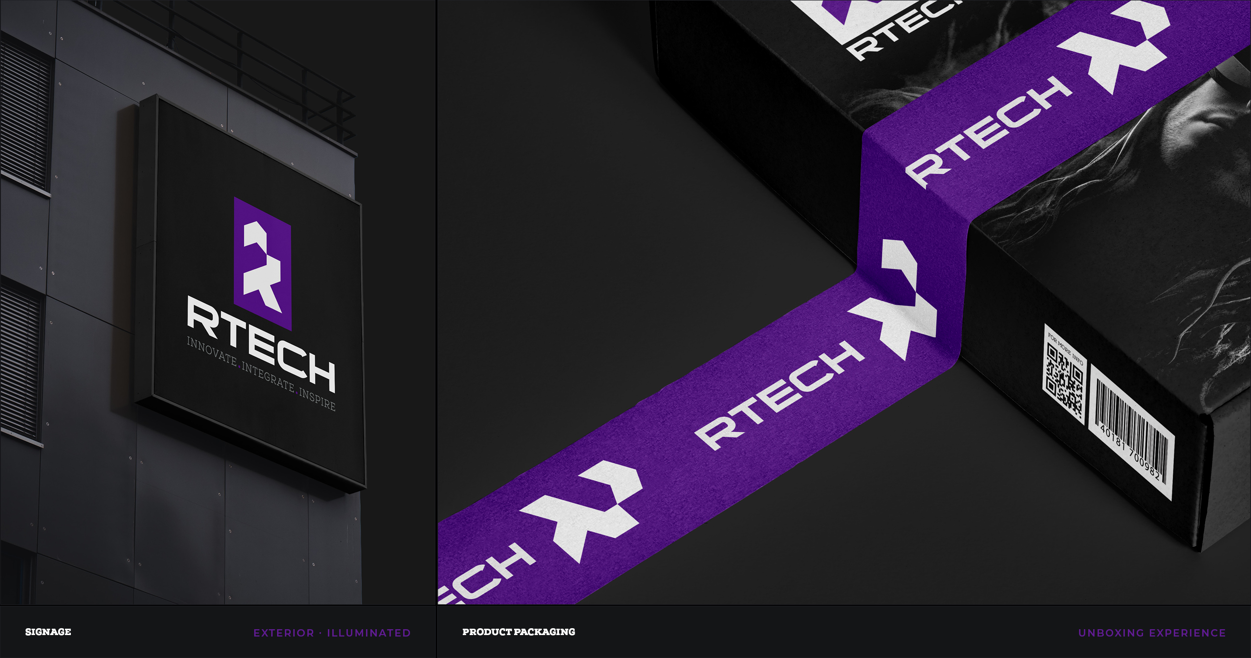
Purple field on black creates a recognisable signal from street level to large-format architectural use, allowing the mark to scale with authority.
Black matte surfaces, silver typography and a strong purple brand band extend the system across boxes, devices, hardware labels and product-led touchpoints.
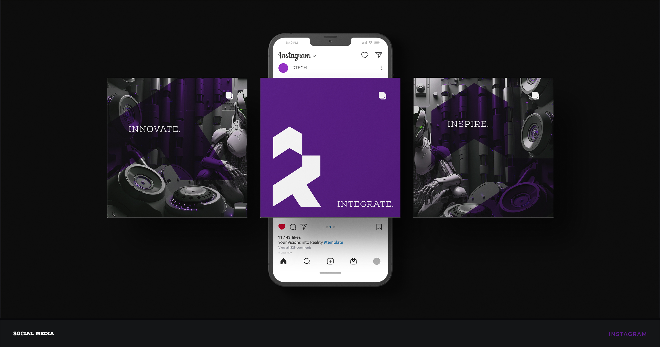
Campaign and event touchpoints follow the same dark, purple and silver system, keeping the brand recognisable across displays, launch content and social posts.